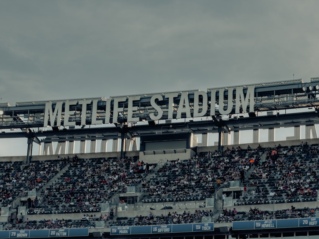
Effective tournament banner design is not just decoration. It is a practical communication tool that sets expectations, builds credibility, guides attention, and helps spectators or players understand the identity of an event before it begins. Whether the event is a local basketball championship, a regional esports qualifier, or a sponsored charity golf tournament, the banner must clearly present the event name, date, venue, sponsors, and competitive atmosphere.
TLDR: A strong tournament banner should be clear, visually disciplined, and appropriate for the sport or game being promoted. The best designs use hierarchy, contrast, team or event colors, and focused imagery to communicate quickly. Sports banners often benefit from motion, action photography, and bold typography, while gaming banners usually rely on atmosphere, digital effects, and character-driven visuals. The 15 examples below show how different tournament types can be presented with authority and impact.
Why Tournament Banner Design Matters
A tournament banner often becomes the first visual contact between the event and its audience. It may appear on social media, printed signage, venue entrances, websites, ticketing pages, live streams, or sponsor presentations. Because of this, the design must work across multiple formats and still remain readable.
Good design does more than look impressive. It helps answer essential questions: What is the event? Who is competing? When and where is it happening? Why should people care? If a banner fails to answer these quickly, even a visually attractive design can underperform.
For serious tournaments, the design should also reflect organization and professionalism. A poorly aligned layout, weak typography, or cluttered sponsor section can make an event appear less reliable. In contrast, a disciplined visual identity strengthens trust among athletes, teams, viewers, sponsors, and media partners.
Core Principles of a Strong Tournament Banner
- Clear hierarchy: The event name should be the dominant element, followed by the date, venue, and registration or viewing details.
- Readable typography: Use bold, legible fonts that remain clear at different sizes, especially for outdoor signage and mobile screens.
- Appropriate imagery: A tennis tournament banner should not feel like a boxing poster, and a strategy gaming event should not look like an arcade racing ad.
- Consistent color palette: Use team colors, league colors, or a controlled palette that reinforces the event identity.
- Balanced sponsor placement: Sponsor logos should be visible but not overpower the event message.
- Format adaptability: A banner should be easy to adapt for print, digital ads, social media headers, and livestream overlays.
15 Tournament Banner Design Examples
1. Football Championship Banner
A football championship banner should communicate strength, scale, and intensity. Deep greens, black, white, metallic gold, or team colors are often suitable choices. A strong design might feature a stadium background, a football in motion, and silhouettes of players in action.
The title should be large and stable, often in a condensed bold typeface. Supporting details such as final match date, venue, and ticket information can sit beneath the headline. For championship banners, the use of a trophy image can add legitimacy, but it should not make the layout crowded.
2. Basketball Tournament Banner
Basketball banners benefit from vertical energy. A player jumping toward the hoop, a textured court background, or orange and black contrast can immediately signal the sport. Because basketball is fast and dynamic, angled lines and motion blur can be used carefully to suggest speed.
For school, college, or community tournaments, include bracket information or division labels only if space allows. The strongest banner designs keep the central message simple: tournament name, date, venue, and call to action.
3. Soccer Cup Banner
A soccer cup banner should feel global, competitive, and clean. Green field textures, stadium lights, club crests, and national or regional color accents can work well. The layout should avoid excessive visual noise because soccer events often involve multiple teams, sponsors, and schedule details.
A useful approach is to place the event title in the center, flanked by team or division identifiers. If the tournament includes youth, amateur, and professional divisions, use separate visual tiers rather than placing every detail into one block of text.
4. Tennis Open Banner
Tennis events usually need a more refined visual style than contact sports. White space, clean lines, and premium typography are effective, especially for club tournaments or sponsored open events. Colors such as navy, green, white, and yellow can suggest tradition and focus.
A tennis banner may use an action shot of a serve, a racket and ball close-up, or a court surface texture. The final design should feel polished and controlled, reflecting the discipline of the sport.
5. Baseball Tournament Banner
Baseball banner design often works well with classic sports visual language: bold serif or varsity-style typography, stitched ball textures, grass backgrounds, and scoreboard motifs. For youth leagues and regional tournaments, a banner can feel energetic while still remaining organized.
Important information should include the tournament name, age group, location, dates, and registration deadline. If the event has a long history, include the year or edition prominently, such as 15th Annual Summer Classic.
6. Volleyball Tournament Banner
Volleyball banners should emphasize teamwork, height, and movement. Beach volleyball banners may use sand, sunlight, and coastal colors, while indoor volleyball banners can rely on strong contrast, court lighting, and team silhouettes.
Because volleyball events often include multiple courts or divisions, clarity is especially important. Use icons or small labels for categories such as men’s, women’s, mixed, or junior divisions instead of long explanatory text.
7. Martial Arts Tournament Banner
A martial arts tournament banner should convey discipline, respect, and controlled power. Depending on the specific style, the design may use black, red, white, gold, or muted earth tones. Imagery should be respectful and accurate, avoiding exaggerated clichés that reduce credibility.
For karate, taekwondo, judo, or mixed martial arts events, include federation or organizing body logos clearly. Weight classes, belt divisions, and registration deadlines may be important, but they should be placed in a structured information area rather than scattered across the design.
8. Golf Tournament Banner
Golf tournament banners usually require a professional and understated approach. This is particularly true for corporate outings, charity events, and sponsor-driven competitions. Greens, blues, whites, and gold accents can create a calm, reputable appearance.
Instead of aggressive motion, golf banners often use scenic course photography, a golfer mid-swing, or a close-up of a ball on the green. Sponsor recognition is frequently important, so allocate a clean lower section for logos and partner names.
9. Track and Field Event Banner
Track and field banners should express speed, precision, and competition. A runner at the starting line, a sprinter in motion, hurdles, or a track lane background can provide immediate context. Red, blue, black, and white color schemes are common because they provide strong contrast.
Since these events may include many categories, limit the main banner to essential details. Schedules, heat sheets, and technical information should be distributed separately or linked through a QR code.
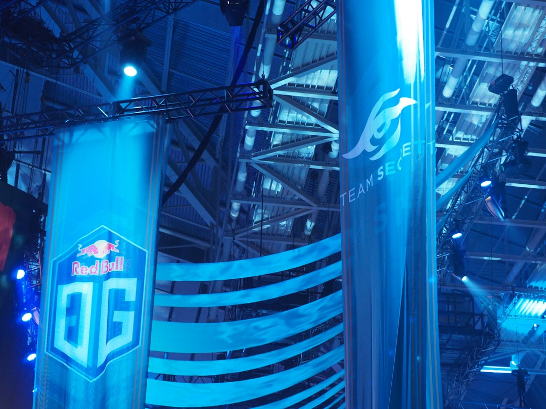
10. Esports Championship Banner
An esports championship banner should feel modern, sharp, and high-stakes. Dark backgrounds, neon highlights, digital textures, and strong glow effects are commonly used, but they must be controlled. Too many effects can make the design look amateur or difficult to read.
The event title should be the most prominent element, often paired with a trophy, controller, keyboard, or abstract digital emblem. Include the game title, prize pool, date, platform, and livestream information. If the event is official or sponsored, place logos in a predictable and balanced arrangement.

11. First Person Shooter Tournament Banner
For a first person shooter tournament, visual intensity is expected. Tactical colors such as black, gray, red, and military green can work well, depending on the game’s tone. Backgrounds may include smoke, sparks, maps, or weapon silhouettes, but the design should avoid becoming chaotic.
Important details include team size, platform, match format, prize pool, and registration deadline. Use bold typography and strong contrast so the banner remains readable during fast scrolling on social media feeds.
12. Fighting Game Tournament Banner
Fighting game banners should emphasize confrontation and character. Split-screen compositions are effective because they suggest direct competition. Bright energy effects, impact lines, and arcade-inspired typography can be appropriate when used with restraint.
The main challenge is avoiding clutter. Fighting games often have strong character art, sponsor logos, brackets, and community details. Keep the headline clean and place secondary details in structured zones so the viewer can process the information quickly.
13. MOBA Tournament Banner
Multiplayer online battle arena tournaments require a strategic and atmospheric visual style. Dark fantasy, futuristic, or map-based backgrounds can help support the theme. Since these games often have established communities, the banner should look polished enough to meet audience expectations.
Include the tournament format, team size, prize pool, and broadcast channel. If the event has qualifiers and finals, use a simple timeline rather than a dense paragraph. A well-made MOBA banner should feel competitive, organized, and serious.
14. Racing Game Tournament Banner
Racing tournament banners should communicate speed and precision. Motion streaks, track curves, tire marks, city lights, or vehicle silhouettes can be used to create impact. Color schemes often include black, red, silver, yellow, or electric blue.
The typography should be slanted or streamlined only if it remains legible. Include the game name, platform, qualifying date, final race date, and any hardware requirements, such as wheel support or controller rules.
15. Chess or Strategy Gaming Banner
Not every gaming banner needs neon lighting or explosive effects. Chess and strategy gaming tournaments often benefit from a more intellectual and restrained design. Dark wood textures, chess pieces, grids, maps, or minimalist geometric patterns can create authority.
Use refined typography and a clear structure. The banner should highlight the tournament name, rating category, time control, platform or venue, and registration details. A serious strategy event is best represented by clarity, not visual excess.
Design Considerations for Print and Digital Use
Before finalizing a tournament banner, confirm where it will appear. A printed entrance banner, a social media post, and a livestream header all require different proportions. A horizontal vinyl banner may need large text visible from a distance, while a mobile advertisement must communicate in seconds on a small screen.
For print, use high-resolution images, sufficient bleed, and strong contrast. For digital use, test the design on mobile and desktop screens. Avoid placing essential information too close to the edges, where it may be cropped by platform previews.
Common Mistakes to Avoid
- Overloading the design: Too many logos, dates, effects, and images can weaken the message.
- Using low-quality imagery: Blurry photos or stretched graphics reduce trust immediately.
- Ignoring hierarchy: If the date is larger than the event name, the viewer may misunderstand the priority.
- Poor contrast: Text must stand out clearly against the background.
- Inconsistent branding: Colors, fonts, and logo placement should support one unified identity.
- Forgetting accessibility: Small text, low contrast, and overly decorative fonts can exclude viewers.
Practical Layout Structure
A reliable tournament banner layout can be built around five sections. First, place the event name in the strongest visual position. Second, add a supporting line that explains the type of event, such as Regional Qualifier or Open Championship. Third, include date and venue details. Fourth, add registration, ticketing, or broadcast information. Fifth, reserve a clean area for sponsors and organizers.
This structure works because it matches the way viewers scan information. They notice the headline first, then confirm the details, then decide whether to participate, attend, or share the event.
Final Thoughts
Tournament banner design requires a balance between visual excitement and reliable communication. Sports events often demand physical energy, movement, and team identity, while gaming events may require digital atmosphere, competitive tension, and platform-specific details. In both cases, the banner must serve the audience first.
The best tournament banners are not merely attractive. They are organized, readable, credible, and aligned with the character of the competition. By studying these 15 examples and applying disciplined design principles, organizers can create banners that support participation, strengthen event identity, and present the tournament with the seriousness it deserves.