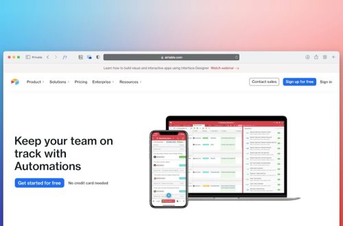

Put the permit answer on the first screen. People visit a permitting website because they need to do a thing, pay a fee, pass an inspection, or stop panicking. Make the next step obvious. Then make every other step boring, clear, and hard to mess up.
TLDR: A useful permitting site tells users what permit they need, what it costs, how long it takes, and what to do next. For example, a restaurant owner should find “Outdoor Dining Permit” in under 30 seconds, see a $250 fee, upload a site plan, and book an inspection without calling City Hall. If 38% of permit calls are about status checks, add a bright “Check Status” button on every permit page. That alone can save staff hours every week.
Start with the user’s problem
Most visitors do not know your department names. They do not care if a permit belongs to Planning, Building, Fire, Health, or Public Works. They care about their project.
So group content by plain tasks:
- Build or remodel
- Open a business
- Host an event
- Work in the street
- Put up a sign
- Schedule an inspection
This feels obvious. Yet many official sites still make users guess which office owns which form. Honestly, it feels like being sent to the wrong counter at the DMV, except the counter is a PDF from 2016.

Use plain words, not office code
Government language can be strange. It grows in basements. It wears a lanyard.
Replace internal terms with words people use:
- Use “Apply for a fence permit” instead of “Residential accessory structure review.”
- Use “Check your permit status” instead of “Permit inquiry portal.”
- Use “Upload your plans” instead of “Submit required documentation.”
- Use “Book an inspection” instead of “Request field verification.”
You can still show official names. Just put them second. For example: Fence Permit, also called Residential Barrier Review. That helps both residents and staff.
Make each permit page follow the same pattern
Consistency is your friend. Users learn faster when every page works the same way.
Each permit page should answer these questions in this order:
- Do I need this permit?
- Who can apply?
- What do I need before I start?
- How much does it cost?
- How long does it take?
- How do I apply?
- What happens after I apply?
- Who can I contact?
Do not hide fees in a 42-page fee schedule. Put the common fee on the page. Link to the full schedule below it. If the fee changes by project size, add examples.
Try this:
- Small deck: usually $85 to $150
- Large deck: usually $150 to $300
- Review time: 7 to 10 business days
Specific beats vague. Every time.
Build a permit finder
A permit finder is a simple wizard. It asks a few questions. Then it points the user to the right permit.
Keep it short. Five questions is great. Twelve is pushing it. Thirty is a cry for help.
Good questions sound like this:
- What are you trying to do?
- Is the work inside or outside?
- Is this for a home or business?
- Will you change plumbing, electrical, or walls?
- What is the project address?
At the end, show a clean result:
You may need: Building Permit, Electrical Permit, and Final Inspection.
Estimated total time: 10 to 15 business days.
Start here: Apply for Building Permit.
That is useful. That is calm. That prevents 11 phone calls.
Make search less terrible
People search for weird stuff. That is normal. Your site should handle it.
A user may type “food truck,” “hot dog cart,” “mobile food,” or “vendor license.” All should point to the same helpful page.
Add common synonyms to page titles, summaries, and hidden search keywords if your system allows it. Review search logs each month. Look for searches with no results. Those are clues with flashing lights.
It drives me crazy when a site returns zero results for “roof permit” because the official page says “re-roofing authorization.” No resident deserves that little word trap.
Design for phones first
Many users apply after work. Some are in trucks. Some are standing in a half-built kitchen. Some are holding a baby and a tape measure.
Your site must work on a phone.
That means:
- Big buttons
- Short forms
- Readable text
- No tiny tables
- No mystery icons
- File upload that works from a camera roll
If a contractor needs to pinch and zoom five times to book an inspection, the site has failed. Test the process on a real phone. Not just a giant monitor in a conference room.
Show status like a pizza tracker
Permit status should not feel like reading tea leaves. Show the steps.
Use labels like:
- Submitted
- In review
- Needs changes
- Approved
- Inspection scheduled
- Closed
Add dates. Add staff comments. Add missing items. If a plan was rejected, say why in human language.
Bad: Insufficient documentation.
Better: Please upload a site plan that shows the fence height, property lines, and distance from the sidewalk.
That one sentence can save days.
Keep forms short and smart
Forms should ask only for what the office truly needs. Not what someone asked for in 2009 and nobody removed.
Use conditional fields. If the user says the project has no electrical work, do not show ten electrical questions. If the user applies as a homeowner, do not ask for a contractor license number.
Also, save progress. People get interrupted. Browsers crash. Coffee spills. A 40-minute form with no save button is how villains are made.
Make documents easy to use
PDFs are not evil. Bad PDFs are evil.
If you must use PDFs, make them accessible, current, and clearly named. A file called Form_Final_New_Updated2.pdf is not clear. Try Sidewalk Cafe Permit Application 2026.pdf.
Better yet, turn common forms into web forms. They are easier to read. They are easier to submit. They are easier to track.
Earn trust with dates and ownership
Every page should show:
- Last updated date
- Responsible department
- Contact email
- Phone number
- Office hours
Old pages create doubt. A resident sees “Updated 2018” and wonders if the fee is still real. Staff then get a call. The circle of annoyance continues.
Set a review schedule. High-use pages should be checked every quarter. Other pages can be checked twice a year.
Measure what matters
Analytics should not be decoration. Use them to fix pain.
Track things like:
- Top permit pages
- Searches with no results
- Form drop-off points
- Status check visits
- Mobile use rate
- Calls by topic
If 52% of users quit on the document upload step, the upload step is the problem. If “inspection time” is a top search, the inspection page needs a better headline. The data is not there to sit in a dashboard. It is there to make the site less annoying.

Write for accessibility
A public site must work for everyone. That includes people using screen readers. It also includes people with low vision, shaky hands, slow internet, or limited English.
Use strong color contrast. Add alt text for images. Write clear link text. Do not use “click here” ten times. Use headings in order. Add captions to videos. Offer key pages in the languages your community uses most.
Accessibility is not extra polish. It is basic service.
Give staff the tools to keep it clean
A good permitting site needs care. Assign page owners. Give them simple editing rights. Create content rules. Use templates. Remove dead pages.
Most of all, make updates easy. If changing a fee requires three tickets and two weeks, the site will go stale. Then users will stop trusting it.
The simple rule
A permitting website should answer real questions in the order real people ask them. It should be fast. It should be clear. It should not require a secret map of City Hall.
Build around tasks. Use plain words. Show costs, timelines, and status. Test on phones. Watch the data. Fix the spots where users get stuck.
Do that, and your official information site becomes more than a digital filing cabinet. It becomes a calm helper. And yes, that is possible. Even for permits.