Build your booking website around one job: helping a person reserve a time, seat, room, table, ticket, or service without getting annoyed.
TLDR: A good booking website needs clear services, live availability, simple forms, secure payment, instant confirmation, and easy changes. For example, a small hair salon with 5 stylists and 40 daily slots can lose 10 to 20 bookings a week if times are outdated or checkout is slow. Keep the flow short: choose service, pick time, add details, pay, get confirmation. That is the whole game.

Start with the main booking flow
Your site can look cute. It can have fancy colors. Great. But if the booking flow is weird, people leave.
The ideal flow is simple:
- Pick a service, room, event, or offer.
- Choose a date and time.
- Add personal details.
- Pay or confirm.
- Receive proof by email or text.
That is it. No maze. No mystery buttons. No forms that ask for a fax number. It drives me crazy when a booking form needs seven clicks just to show the price.
Essential features your booking website needs
Think of these as the parts under the hood. If one breaks, the whole ride feels bad.
- Real time availability: Show only open slots. Never let two people book the same time.
- Calendar view: Let users scan days fast. Month, week, and day views help.
- Service or product details: Add duration, price, location, staff member, and what is included.
- Smart forms: Ask only what you need. Name, email, phone, and special notes are often enough.
- Online payment: Take deposits, full payments, or card holds. This reduces no shows.
- Confirmation messages: Send email and SMS right away. Include time, address, price, and change links.
- Reschedule and cancel options: Let users fix plans without calling you at lunch.
- Admin dashboard: Your team needs to view, edit, approve, refund, and block slots.
- Notifications: Send reminders 24 hours before and 2 hours before. Simple. Useful.
- Mobile friendly design: Most users will book from a phone. Buttons must be big.
Pages every booking website should include
A booking site does not need 80 pages. It needs the right pages.
1. Home page
This page answers three questions fast. What do you offer? Why should I trust you? How do I book?
Add a bold booking button near the top. Use text like Book Now, Check Availability, or Reserve Your Spot. Do not hide it in a tiny menu.
2. Services or listings page
This is where users compare options. A spa might show massages, facials, and packages. A hotel might show rooms. A tutor might show lesson types.
Each card should include:
- Name
- Short description
- Price
- Duration
- Photo
- Next available time

3. Detail page
This page sells the choice. Keep it clear.
Show photos, what is included, rules, location, staff, reviews, FAQs, and the booking widget. If users must scroll forever to find the button, expect drop offs.
4. Booking page
This is the money page. Treat it like a checkout lane.
Show the selected item, date, time, price, taxes, fees, and cancellation terms. Keep the form short. Use progress steps if needed. For example: Details → Payment → Confirmation.
5. Confirmation page
Do not just say “thanks.” Give the user everything they need.
- Booking ID
- Date and time
- Address or meeting link
- Payment status
- Add to calendar button
- Reschedule link
- Cancel link
6. Account page
Not every site needs accounts. But repeat bookings are easier with them. Users can see past bookings, upcoming plans, invoices, and saved details.
7. Help and policy pages
Add clear pages for refunds, cancellation rules, contact details, privacy, and terms. Boring? Yes. Useful when someone wants their money back? Very.
Key user flows to map before building
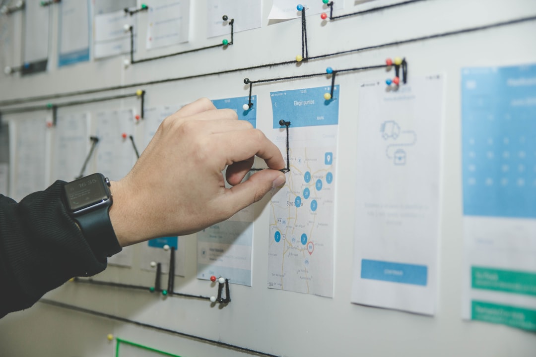
A user flow is the path someone takes. Sketch it before you write code or buy software. Sticky notes work. So does a napkin.
Flow 1: New user books a service
- User lands on the home page.
- User clicks Book Now.
- User picks a service.
- User chooses a time.
- User enters details.
- User pays a deposit.
- User gets confirmation.
This flow should take under 3 minutes. If it takes longer, trim questions.
Flow 2: Returning user books again
This should feel almost too easy. Let the user log in, repeat a past choice, pick a new time, and confirm. Saved details help a lot.
Flow 3: User changes a booking
Plans change. Kids get sick. Trains run late. Let users reschedule from the confirmation email. Add rules like “changes allowed up to 12 hours before.”
Flow 4: Staff manages bookings
Your team needs a calm admin area. They should see today’s bookings, customer notes, payments, and open slots. Color coding helps. Search helps more.
Honestly, it feels like some admin panels were built by people who never had a customer waiting at the desk. Do not make staff click 6 times to mark someone as arrived.
Design tips that make booking feel easy
- Use one main button color. Make the booking action obvious.
- Show prices early. Surprise fees kill trust.
- Use plain language. “Choose time” beats “select temporal slot.”
- Make errors helpful. Say what went wrong and how to fix it.
- Keep forms clean. One column works best on phones.
- Add trust signals. Reviews, badges, secure payment notes, and real photos help.

Useful extras after the basics work
Add these once the core flow is solid. Not before.
- Promo codes: Great for campaigns and loyal customers.
- Gift cards: Strong fit for salons, spas, classes, and events.
- Waitlists: Let people join when a slot is full.
- Group bookings: Useful for tours, workshops, and fitness classes.
- Multi location support: Helpful for growing businesses.
- Analytics: Track views, started bookings, completed bookings, and drop offs.
Numbers to watch
Your booking site should improve over time. Watch the simple stuff first.
- Conversion rate: The percent of visitors who book.
- Abandoned bookings: People who start but do not finish.
- Average booking time: Aim for 2 to 3 minutes.
- No show rate: Reminders and deposits can cut this by 20% or more.
- Mobile bookings: If 70% of users are on phones, design for thumbs.
Final checklist
Before launch, test the site like a tired customer on a cracked phone screen.
- Can users book in under 3 minutes?
- Are prices clear before payment?
- Do confirmations arrive fast?
- Can users cancel or reschedule?
- Can staff edit bookings without pain?
- Does the site work on mobile?
- Are empty slots, full slots, refunds, and errors handled?
A great booking website is not about flash. It is about fewer questions, fewer clicks, and fewer angry emails. Make the path clear. Keep the calendar honest. Send confirmations fast. Then people can book, pay, and get on with their day.